

The standard EN ISO 3668 Paints and varnishes - Visual comparison of paint colours", based on a European standard and subsequently published by the International Standards Organisation (ISO), describes a method for visually comparing the colour of films of paints or related products with a standard (a reference standard or a newly prepared standard) using artificial light sources in a standard cabin. This standard does not apply to coatings containing, for example, metallic, special effect pigments, without prior agreement on all details of the lighting and viewing conditions.
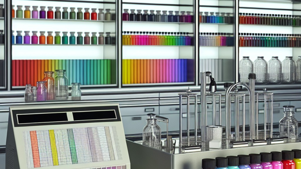
In principle, the colours of the paint films to be compared are observed under specified illumination and viewing conditions using a colour matching booth. A procedure for the expression of colour difference components (hue, colour brightness and luminance), i.e. the description using a specific grading scheme, is defined. The assessment of metamerism is also taken into account. Metamerism is the perceived matching of colours with different spectral power distributions.
Natural daylight is variable in quality and observers’ judgements are likely to be influenced by nearby coloured objects. Therefore, for refereeing purposes, closely controlled artificial lighting should be used in the colour matching booth. The observer should wear neutral coloured clothing and no strong coloured surfaces should be allowed in the field of view other than the panels being tested.
The colour matching cabinet shall be an enclosure from which external light is excluded and which is illuminated by a light source whose incident light on the test panel is close to the spectral power distribution of CIE standard illuminant D65, CIE standard illuminant A (ISO 11664-2) or CIE illuminant FL 11. If a light source with a different spectral distribution is used, this shall be agreed upon by the parties concerned. The quality of the simulation of daylight shall be assessed by the CIE method specified in CIE publication no 51.2 and ISO 23603. The spectral distribution of the illuminant shall be in category BC or better.
The illumination level in the colour matching position should be between 1000 lx and 4000 lx, with a figure closer to the upper end of the range for dark colours. For general use, the interior of the colour matching stand should be within the values given in the standard. However, if mainly light colours and colours close to white are to be compared, the interior of the stand can be painted as specified in the standard to provide a lower brightness contrast with the colour to be examined.
In order to provide a suitable surrounding area for colour comparison, the table surface in the booth should be covered with a neutral grey panel and the illumination factor should be selected in the same colour as the light booth. A diffusing element (for example a diffusing screen) should normally be used to distribute the light and prevent the lamp image from reflecting off the test panel. The spectral distribution characteristics of the light source will include the spectral transmission of the screen. The manufacturer of the light source should state the number of operating hours that his product can be expected to comply with this standard.
Observers should have normal color vision and should be carefully selected because a significant proportion of people have defective color vision. An Ishihara test will reveal serious defects, but more sensitive tests, such as the Farnsworth 100 color test or the more stringent anomaloscope measurements, are preferred for verifying an observer's suitability. If an observer wears glasses to correct his vision, these should have uniform spectral transmission across the visible spectrum. Since color vision changes considerably with age, it is preferable for observers over the age of 40 to be tested using a suitable method in which the observer is asked to select the best match from a series of metameric colors. For color comparison work, not only normal color vision but also color discrimination ability or experience is important. To avoid eye strain effects, pastel or complementary colors should not be viewed immediately after strong colors.
When comparing bright, saturated colors, if judgment cannot be made quickly, the observer should look at the neutral gray of the surrounding area for a few seconds before making further comparisons. The quality of visual judgments is severely impaired if the observer is constantly working. Therefore, rest periods of several minutes should be taken frequently, during which no color matches are attempted.
Both the test panels and the reference colour standards should be flat and preferably approximately 150 mm x 100 mm in size. Suitable materials for the test panels are tinplate, solid aluminium, glazed cardboard, steel or glass in accordance with ISO 1514. The panel size and viewing distance should be chosen so that the panel covers an observation area with an aperture approximately 10 degrees from the eye. If larger panels are used, a field of view corresponding to 10 degrees of the observer should be created using a grey mask. Typical viewing distances and dimensions for square apertures of the mask are given in the table given in the standard.
Only colour standards with satisfactory colour retention should be used as reference standards. Wherever possible, reference standards should be the same size as the test panels and should have a similar gloss and surface texture. Reference panels should be stored at an ambient temperature of 23°C plus/minus 5°C and preferably in a dark place, out of direct sunlight. To protect the surface of the panels from impact and scratches, the panels are packed in contaminant-free paper bags.
Test panels are prepared as specified and in accordance with ISO 1514 where appropriate. The panel should be coated by a closely specified or agreed method as the method of application and film thickness can significantly affect the colour. If the test panel is to be compared with a standard paint, it should be coated with the paint or system being tested and a similar panel should be coated with the standard paint or system. The method of application and the applied film thickness should be as similar as possible. The applied film thickness should preferably be such that the substrate is completely hidden in order to eliminate the influence of the substrate.
Each coated test panel is dried or baked for a minimum of 3270 hours under the specified conditions and for the specified time in the standard atmosphere specified in the ISO 16 standard, with free air circulation and no exposure to direct sunlight.
Our organization, which has been trying to support businesses from every sector with its wide range of testing, measurement, analysis and evaluation studies for years, has a strong staff that closely follows the developments in the world in the field of science and technology and constantly improves itself. In this context, testing services in accordance with the "EN ISO 3668 Paints and varnishes - Visual comparison of paint colors" standard are also provided to businesses.
To get an appointment, to get more detailed information or to request an evaluation, you can ask us to fill in our form and reach you.